AMLAK PLUS / BRAND IDENTITY
Assets.
Connected.
A visual identity for a smarter property ecosystem.
Explore the system
Many assets.
One clear system.
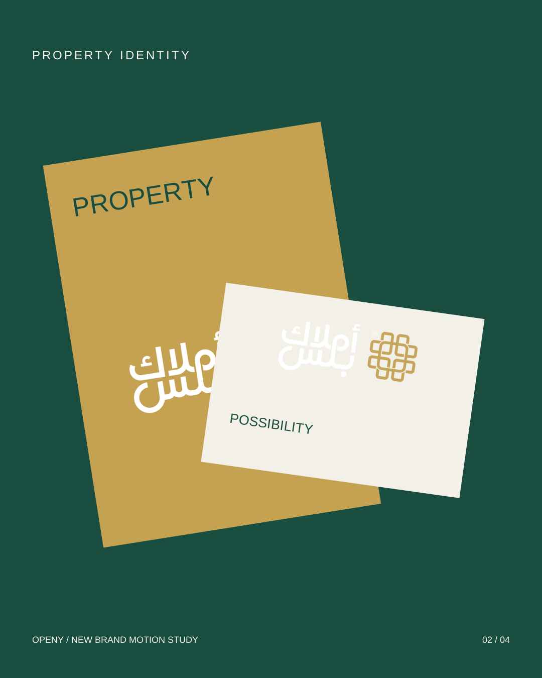
The identity brings the logic of property, data and organisation into one interlocking mark. Forest green establishes a calm foundation; gold gives the system its distinctive signature.
 THE PRIMARY SIGNATURE
Designed to
work together.
01
Interlocking geometry
A modular symbol built around connection.
02
A bilingual signature
Arabic and English within the same identity.
03
A consistent presence
From the smallest touchpoint to the full brand world.
01 / FOREST#184D40
02 / GOLD#C5A251
THE IDENTITY IN CONTEXT
Quiet confidence.
Selected brand applications and presentation studies.
THE MARK IN MOTION